Table of contents
What is Flexbox?
Flexbox allows us to easily design and structure responsive web layouts.
Flexbox layout provides us a more efficient way to manage items of a particular container.
Flexbox layout aligns, shrinks items or make space among items by occupying the given space, and makes the website responsive.
The display property
If you want to use Flexbox in CSS, set the display property to flex, It's the first thing you have to do.
In Flexbox you have to take care of two things.
Outer Container
Internal Container
The majority of the work is done via outer container only.
Flex Properties for the outer container
Flex-direction
It establishes the main axis for the flex-items, on which the flex-items are laid out.
Justify-content
Justify-content will justify the content in the horizontal direction.
No, this is wrong we can see why?
Justify-content is working on the main axis, and align them on the main axis.
The main axis and the cross axis will decide by the flex direction.
Difference between space-between, space-around and space-evenly.
space-between
This is the case the available space is distributed between the items only.
There is no space between the container’s border and the first item, The same effect is applied to the last item, too.

space-around
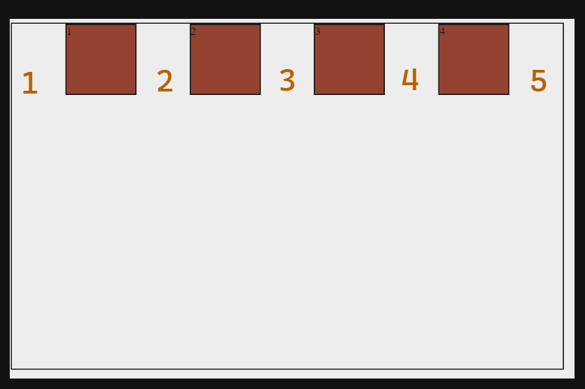
The difference between space-between and space-around is there is space between the container’s border and the first and last items.
As you can see in the image below, the space of the marked number 1 and 5 is half of 2,3 and 4.

space-evenly
Similar to space-around, space-evenly assign space between the first and last lines of the items and the container’s border.
However, the difference is the spaces marked 1 and 5 are equal to 2,3 and 4.

Align-items
Align items will justify the content in the vertical direction.
No, this is wrong,
Align-items is working on the cross axis, and align them on the cross axis.
Flex-wrap
It defines whether the flex items are forced in a single line or can be flowed into multiple lines.
In default, flexbox has nowrap property which tries to fit all content in one line which may change the original width and height of an item.
It has 3 values
flex-wrap: nowrap;
flex-wrap: wrap;
flex-wrap: wrap-reverse;
Flex-flow
The two properties flex-direction and flex-wrap are used so often together that the shorthand property flex-flow was created to combine them. This shorthand property accepts the value of the two properties separated by a space.
For ex.
flex-flow: column wrap;

which is same as
flex-direction: column;
flex-wrap: wrap;
Align-content
Align-content aligns the container’s lines on the cross-axis, similar to how justify-content aligns individual items within the main axis.
Flex Properties for the inner container
order
align-self
flex-grow
flex-shrink


